Pavement plots


![]()
A pavement plot visualizes univariate data as boxes stretching from min to max, each holding an equal share of the data. Where the data is denser, lines are denser, making visual interpretation intuitive. It's a quantile plot you can take in at a glance: a cousin of box plots and rug plots, with no assumption of central tendency, and better suited to large data sets.
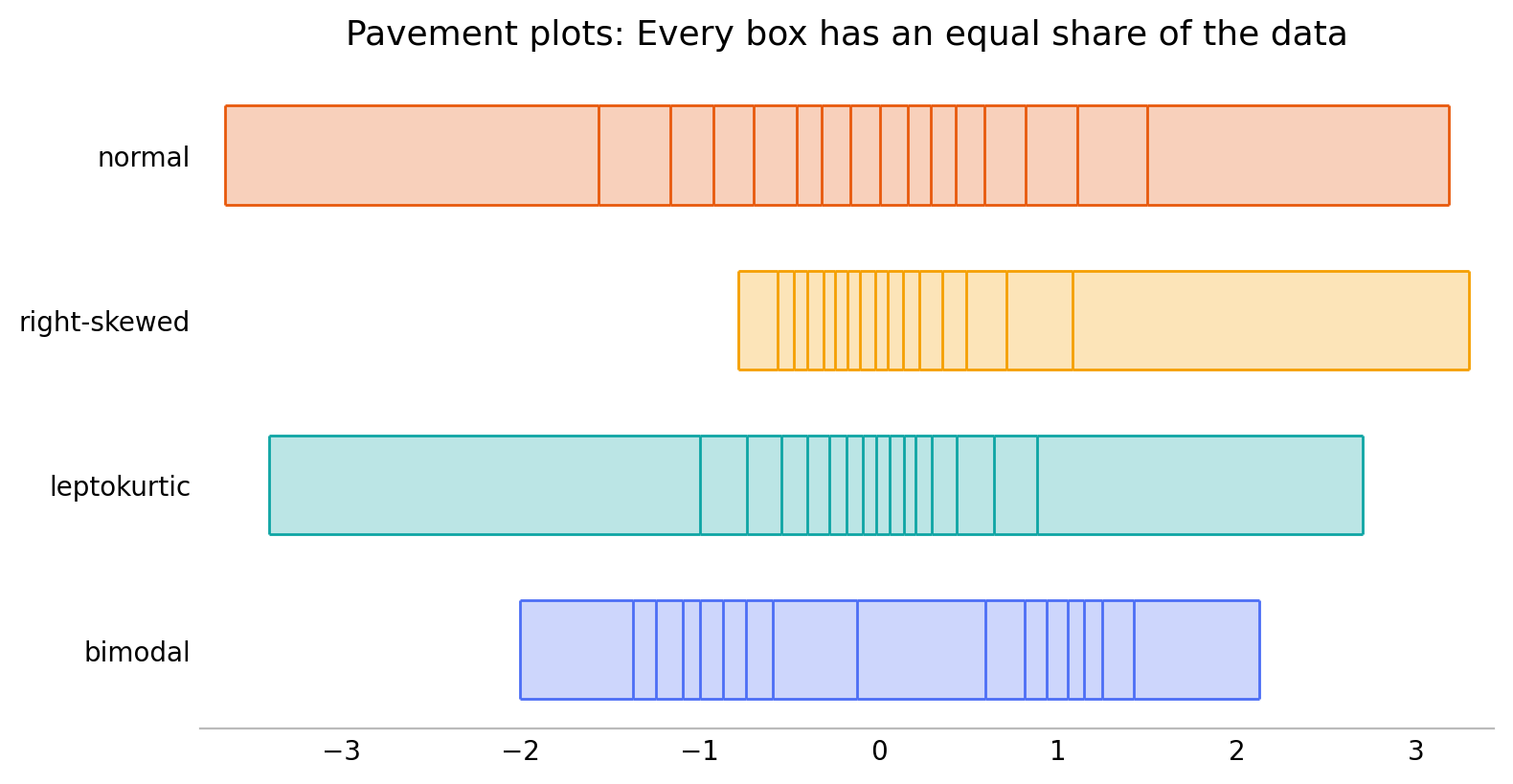
Four classic shapes, each as a 16-bin pavement. The tight cluster of lines is where the data piles up; the wide boxes are the sparse tails — two humps for the bimodal set, a heavy peak for the leptokurtic one, a long tail for the skewed one.
One API, many canvases. Pick a backend by importing its submodule:
- Static images
- matplotlib — also supports marginal strips and 2D pavements
- Interactive visualizations, with hover info built in
- Bokeh, Plotly, HoloViews (including marginal helpers)
pavement.svg— dependency-free inline<svg>sparklines for the web
import pavement.matplotlib as pavement   # or .bokeh / .plotly / .holoviews
pavement.plot([1, 2, 3, 4, 5])

import pavement.svg                      # sparklines for HTML: svg has spark, not plot
pavement.svg.spark([1, 2, 3, 4, 5])     # an <svg>...</svg> string
Glance at a whole dataframe
pavement.summary(df) turns a pandas or polars dataframe (or Series,
or plain sequence) into an inline table. Each variable is shown with a
tally plot (how much is distinct / duplicate / missing) and a
distribution plot that adapts to the column: a pavement spark for
numbers, dates, and durations, and a proportion strip for
categories. It needs no plotting dependency and renders inline in a
notebook; in a browser its rows are drag-to-reorder by default — the
one sprinkle of JavaScript, which stays out of notebooks and static
exports (and is off with draggable=False).
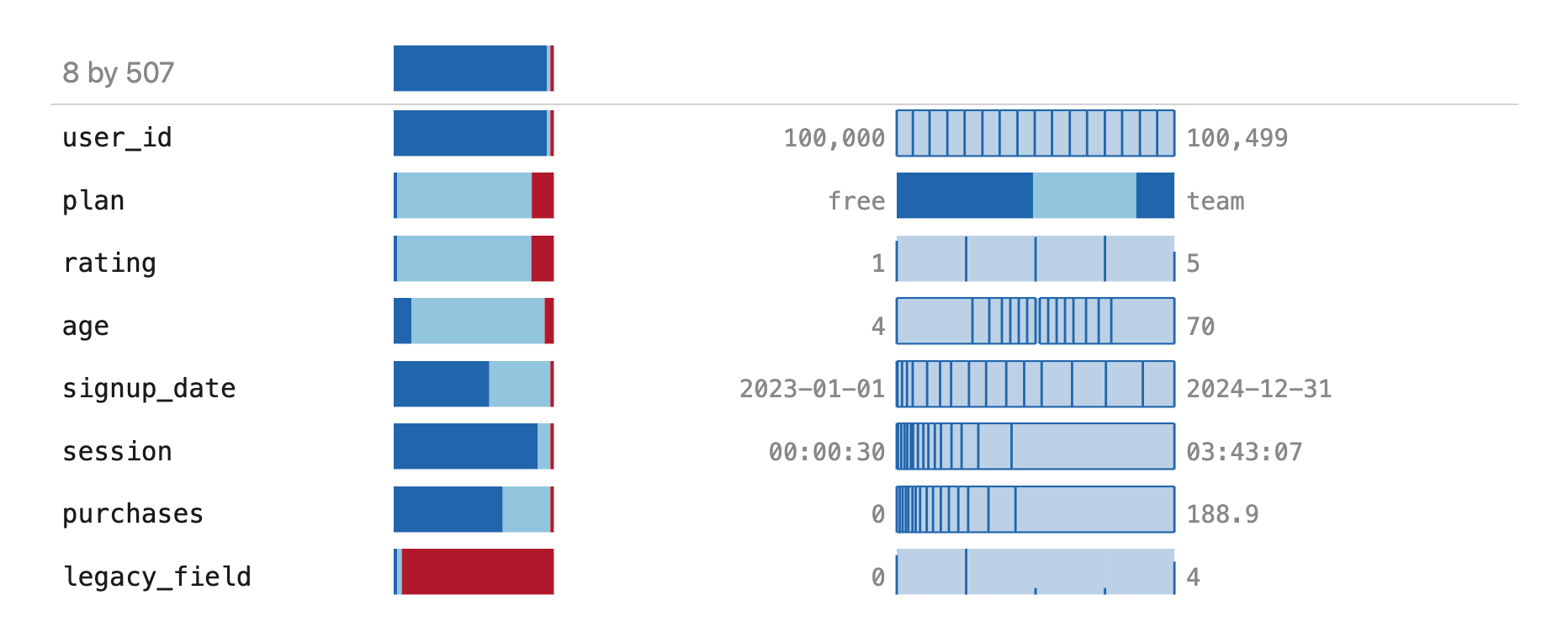
Every column kind at once: an all-distinct id, a category (plan), a discrete
rating drawn as a frequency rug, a continuous age, a date on a time axis, a
duration, a long-tailed purchases, and an almost-all-missing legacy_field.
The top row summarizes the frame itself.
See examples/ for lots more, including
svg_demo.py (inline sparklines),
interactive_demo.py (Plotly, Bokeh, HoloViews),
pandas_polars_demo.py (the .pave accessor),
and real_data.ipynb (singer heights, US income).
-
User Guide
Every backend, the shared
plotAPI, rugs, marginals, sparklines, and dataframe summaries — walked through end to end. -
Examples
Live, interactive outputs — Plotly, Bokeh, inline SVG sparklines, and whole-dataframe summaries — straight from the
examples/scripts. -
API Reference
Auto-generated from the docstrings: the backend-agnostic statistics and every backend's
plot,spark, and helpers. -
Install
Pure-Python core, zero required dependencies. Add a backend with
pip install pavement[plotly](ormatplotlib,bokeh,holoviews).