Looks like people don't die on weekends
Saturday May 2, 2020
Like a lot of people, my hobby recently has been checking COVID-19 stats more often than is helpful. It can be hard to tell if a new day's numbers are relatively good or bad, in part because of a distinct weekly pattern.
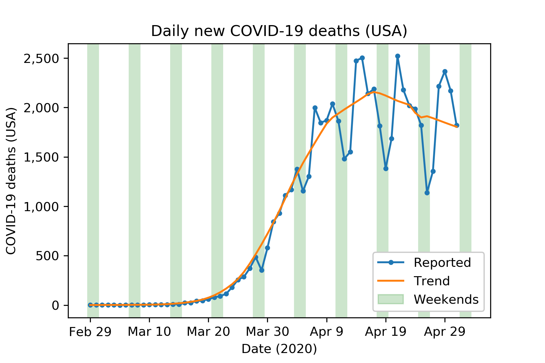
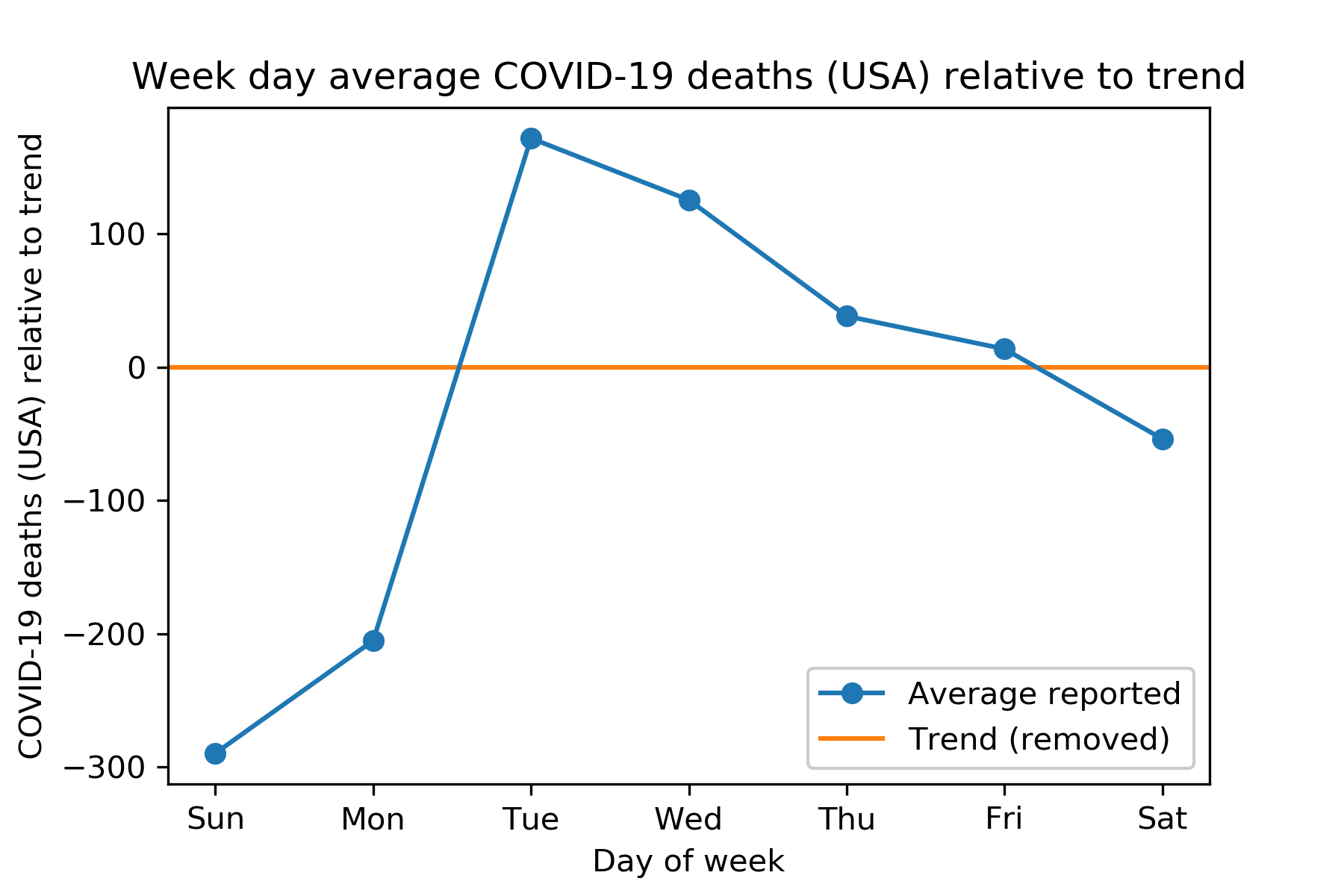
If you take out the trend, it's clear that there are consistently relatively fewer deaths reported on Sundays and Mondays. There's a compensatory tendency for Tuesdays and Wednesdays to have higher numbers of deaths reported.
This clearly shows that the way to fight COVID-19 is by instituting an all-weekend policy.
But it really is an interesting phenomenon. What's causing this effect in the data?
- Do people really avoid death on weekends? I could imagine a small effect in that direction, but I wouldn't think it would be anything like this big.
- Is it purely a reporting effect? Lots of health professionals are working weekends these days, I suspect, but maybe clerical staff or others in the reporting chain take consistent weekends? I suspect this is the main explanation.
- Why is it primarily Sunday and Monday rather than Saturday and Sunday? Do the daily numbers correspond more accurately to the prior day?
In any event, it's a good idea to, for example, use a 7-day rolling average (as in the Financial Times) to avoid being mislead by this weekly pattern.
Update 2020-05-04: The plot above uses an average of numbers of deaths, which feels raw and real, but isn't super meaningful against the changing scale of the pandemic in the US over time. The version below is by percent difference (weighted by the trend, to avoid undue influence when the numbers were all small and the fit of the trend isn't as good.)
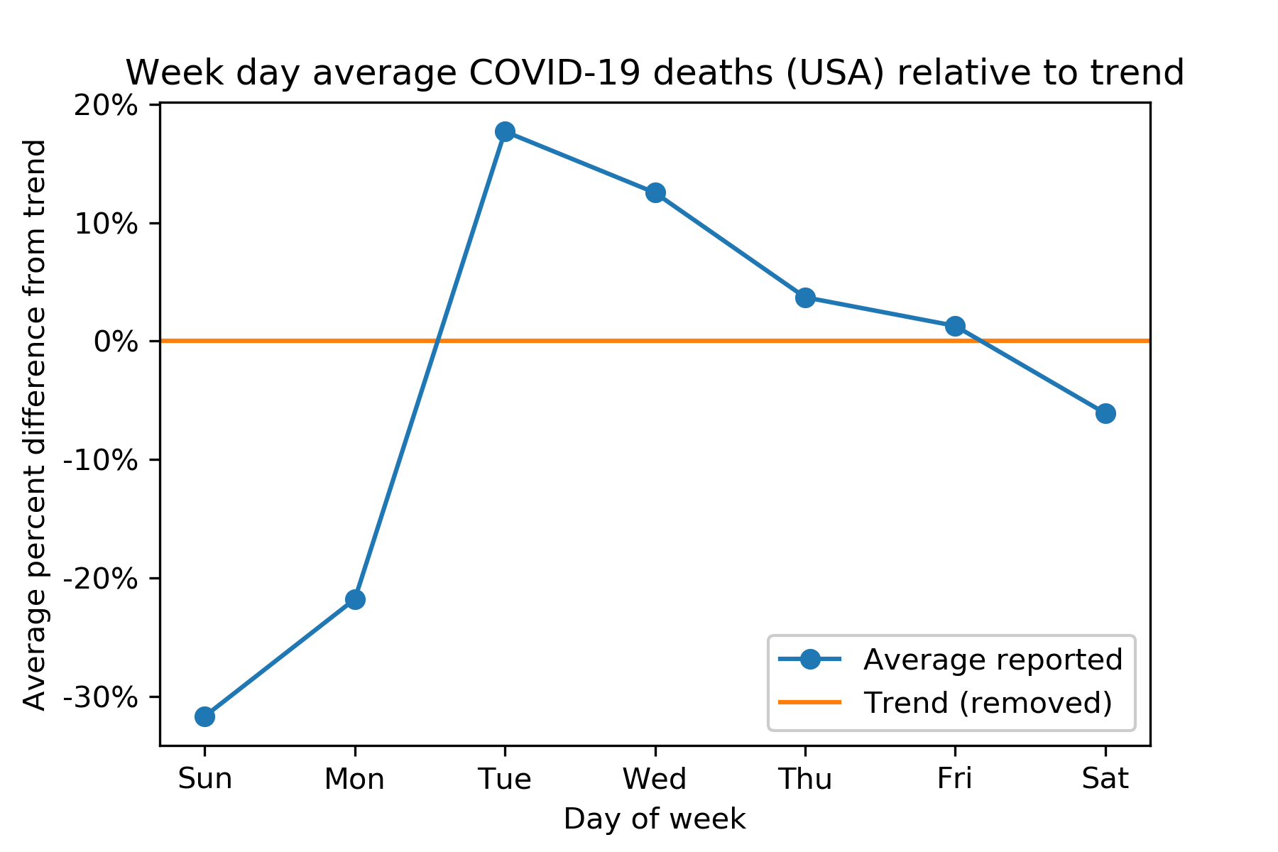
The plot looks very similar, but these percentages can be used (with a little math) to try to "seasonally adjust" daily US COVID-19 death numbers. I'm not saying this has any particular statistical validity, but it's one way to try to guess what a Sunday or Monday number really means, for example.
I used the New York Times' covid-19-data. My code is all up on GitHub.