Calendar Plots should be Easy
Monday December 29, 2014
Popularized by Mike Bostock's example and the GitHub contribution calendar, calendar plots have some recognition now.
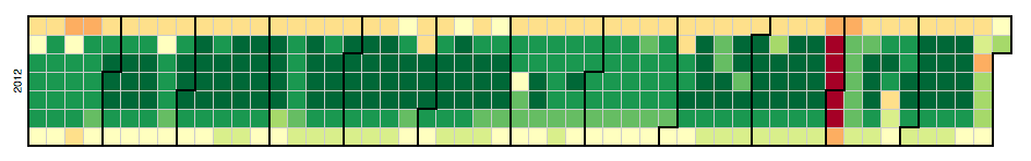
Calendar plots can be very good for showing daily data over time when weekly, monthly, and yearly structure are relevant. While color is not ideal for conveying numeric data, patterns can be made quickly discernible and interaction can add table lookup functionality.
I've made plots like this myself, but it has required fiddling with HTML, CSS, and JavaScript in typical D3 fashion. There are some tools for making it easier to build these plots, like the Cal-Heatmap JavaScript plugin and the Google Charts Calendar Chart, but even with these it's still an HTML/JavaScript affair.
I want to be able to do something like this in R and get an interactive calendar plot:
# this package does not (yet) exist
library(plotcal)
plot.cal(values, dates)
I want to be able to do something like this in Python and get an interactive calendar plot:
# this package does not (yet) exist
from plot_cal import plot_cal
plot_cal(values, dates)
Such functionality could also interact more closely with data.frames/DataFrames, tuples, maps/dicts, etc. That would be fine.
Somebody should make such functions, or extend some existing packages to include them. Or if such things already exist, somebody should just tell me about it. Either way, I will say thank you.