Redesigning a double pie chart
Sunday October 6, 2013
How helpful are these pies?
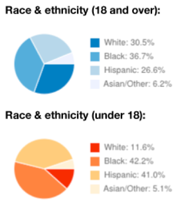
Thankfully, all the data is presented in quasi-tabular form. I imagine the most common way to use this "visualization" would be to read the numbers from the legends and ignore the pies altogether. (On those numbers: I think going to 0.1's is really too much precision for this display, though it does make things add up to exactly 100%.)
To interpret the pie charts you have to interpret shades of color, reading back and forth from legend to pie. The overall colors (blue and red) are different but it isn't clear that they should be. This means you'll probably have to start over with working out the legend for the other pie, making comparisons even more difficult. The order of the categories is seemingly arbitrary; to find the most common or least common category you have to read all the numbers or work through the color intensity codings.
A visualization should help the reader to quickly understand the data and to make comparisons. I mocked up this alternative design:

The biggest improvement might be just from putting the categories in order from most to least common. The "parts of the whole" idea sometimes used to justify pie charts is gone here and should not be missed. It isn't just that viewers can now use their very good perception of linear distance in this version - the salient comparison between adults and children is now front and center.
(I think it's largely Nathan Yau who popularizes slope graphs of this type. I may have seen them in one of Tufte's books too.)
This post was originally hosted elsewhere.