Degree Qualification Profiles: Cool idea, bad map
Monday August 26, 2013
The National Institute for Learning Outcomes Assessment (NILOA) and The Lumina Foundation for Education have a neat idea called the Degree Qualification Profile which is, as I understand it, about figuring out whether people learn anything in college. Neat!
I have an issue with this map from the DQP page:
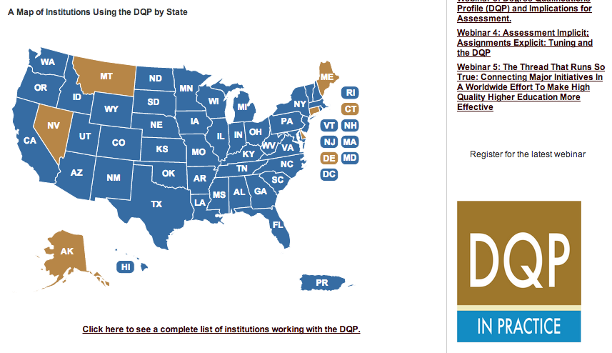
This is not such a bad map, and you might guess the correct interpretation, but it doesn't have a proper legend, which is bad, and it does have an improper (probably accidental) legend, which is worse! If you just look at this thing, the color with the big "DQP" in the lower right there perfectly matches a color on the map - and if you interpret this in the natural way, you conclude that DQP only has a presence in a half dozen states, which is exactly the opposite of what it's trying to show! You can also figure out the correct interpretation as soon as you start mousing over the map, but if you just look at it you could easily get an impression quite far from what they really want to convey. The "IN PRACTICE" rectangle is a shade of blue that doesn't seem to relate to anything. Bad map.
This post was originally hosted elsewhere.